OK, I toured a great house today. It is in a good location, it has been well updated, I even liked the layout and the landscaping. Even the price is right, so it has so much going for it.
Some of the art in the house was very cool and some of it was rather odd.
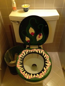
There was a couple pieces of art that were a little bit distracting, but there was one that just made me stop in my tracks.
This sums up the “How NOT to Stage Your Home”. Don’t have art that might put a buyer off or art that is so distracting so the clients remember the art instead of the house, and remember to put the toilet seat lid down, especially if it looks like this!


